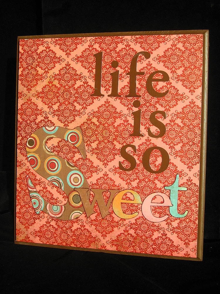
I have this inner debate going on....
When we first opened our store, we used our store logo (which sister K designed) as our avatar (the little picture by your name). As I participated in the forums, I started wondering if we should be using a picture of one of our products.
When I see a cool avatar, I'm more likely to click on that store and check it out. So I changed our avatar to one of our pillows. A few weeks later I changed it to the sign pictured.
I haven't noticed an increase in traffic to our store, in fact, it's been down right slow. Looking at the message board, it seems like this month is exceptionally slow all around. So that might be part of it. It just seems like we have more people looking at our stuff when our logo was our avatar. Part of that might have been, the "regulars" seeing a "new face" and checking us out...
Hmmm..........what to do?

4 comments:
I like the sign - Its positive and upbeat, I think that encourages people to take a look.
You're items are beautiful
i like the sign too!
the sign is really cute...
I like the tie-in with the logo, myself
logo, av, banner....should all be the same look
just my humble opinion
Post a Comment